When we talk about logos, we think of companies such as Nike, Apple, Coca-Cola, and McDonalds. All have iconic logo designs that are recognized all over the world. The consumers are the ones that have made these products relevant because of their brand loyalty. No pressure, but logos make or break a brand and are fueled by the consumer.
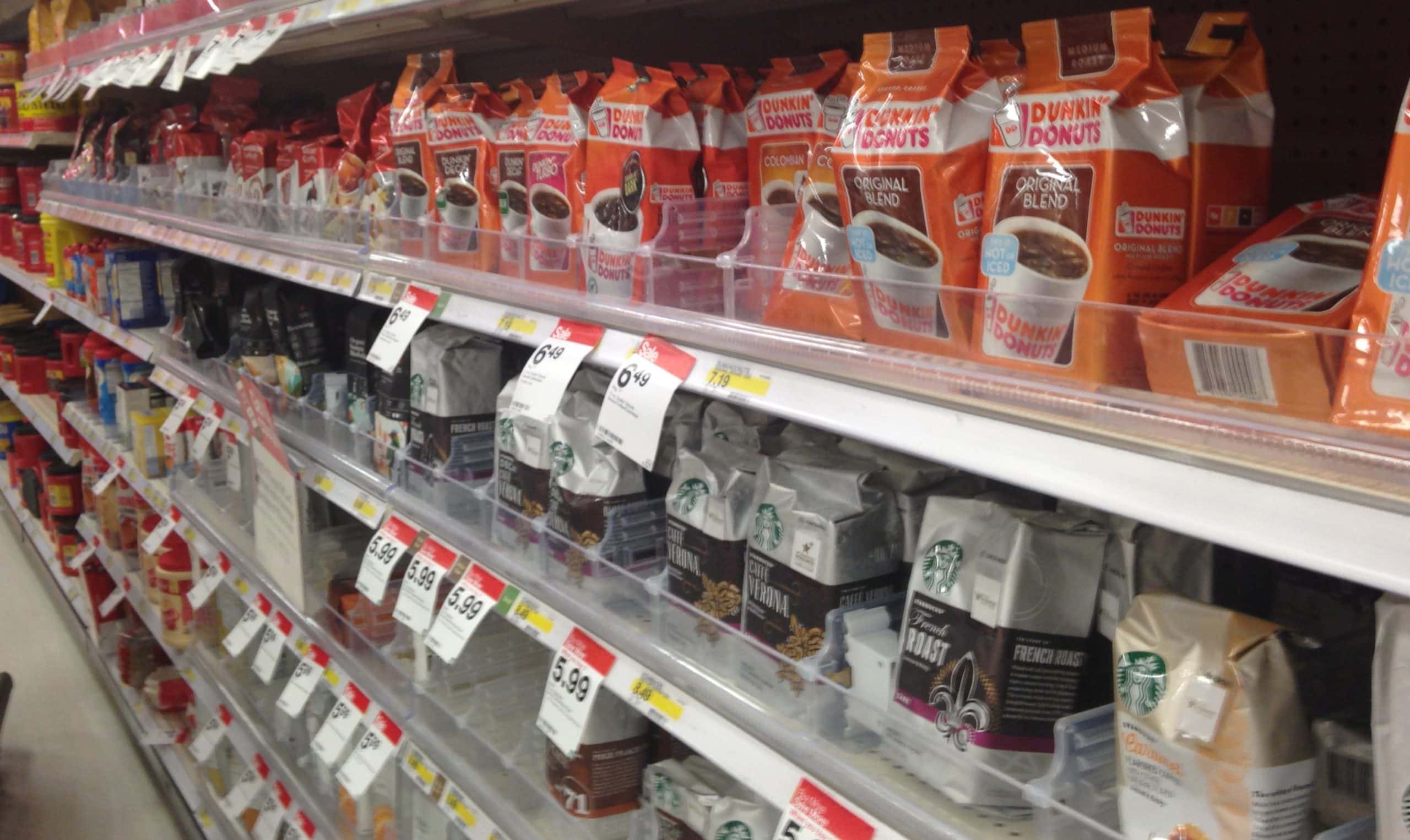
Speaking of fuel, lets talk about my favorite drink, coffee. As I wander down one of my favorite aisles at Target, there are rows and rows of glorious brands of coffee! BUT there are only a few that I believe really have “perked up” the market.
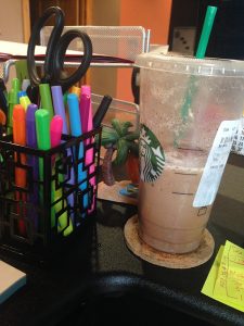
As I write, I’m currently sippin’ on my Chile Mocha Frappuccino – yes Starbucks has me for life! This green and white logo is known and recognized all over the world for putting her spell on all who drink the product she represents. Even though it has nothing to do with coffee, the Starbucks Siren has made many of coffee drinkers loyal to the Starbucks brand.
My favorite when traveling through random airports has to be Caribou Coffee. Caribou is a reindeer, (again, having nothing to do with coffee) but I love the logo. It is memorable for sure. The browns and blues and very appropriate and the freestyle, loosy goosy illustration of a caribou for a coffee company works well for them and me too because I like to stay awake!

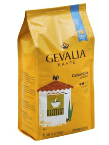
Here at Midwest Marketing our choice cup of Joe is Gevalia. (We are waiting for Johan to serve it to us.) Gevalia’s logo is simply royal. The font with the crown is memorable, appropriate, simple, versatile and most important timeless. They are the ones that are around for ages and have a brand longevity that your forgettable trendy roasters do not have. Although they have a classic logo, they definitely do not follow the norm and the yellow bags, along with their smooth taste make them stand out!
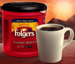
When you say “Foldgers” most people will finish the jingle for you. Growing up, that really was the best part of waking up! The aroma of an early morning brew at my mom’s made me fall in love with not only the smell but the taste of coffee. The red can with the white lettering in front of a sunrise is genius! It creates an inviting feeling with a logo that compliments their product. It is plain and simple, and stands by a product that is invigorating with every sip.
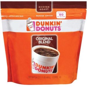
Last but not least, Dunkin’ Donuts. Again, their logo is very versatile and appropriate, fun and youthful. That’s why my grandma, 102 years young, chooses to drink Dunkin Donuts. Perhaps it’s the key to the fountain of youth! The pink and orange colors are super fun. Even though there is no donut, the logo is strong enough that by seeing the “DD” alone the consumer knows exactly who they are and what product they are promoting.
So, a logo doesn’t need to say what a company does. Restaurant logos don’t need to show food, dentist logos don’t need to show teeth, furniture store logos don’t need to show furniture. The Mercedes logo isn’t a car and the Apple logo isn’t a computer. “It is only by association with a product, a service, a business, or a corporation that a logo takes on any real meaning. A logo derives its meaning and usefulness from the quality of that which it symbolizes.” – Rand Paul.
If you’re looking for a new logo to brand your company, contact us at Midwest Marketing!
