With the average person encountering up to 10,000 ads each day, it’s critical to make sure you have a well-thought out banner ad design that stands out so you don’t waste your marketing dollars. But what goes into effective website banners? The graphic design and digital marketing pros at Midwest Marketing are here to let you in on what makes a website banner just beg to be seen and clicked on!
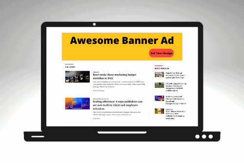
An effective banner contains four essential parts:
1. Company name/logo – Making sure your banner is immediately identifiable as belonging to your business is crucial. Strategically place your company logo along one of the edges of the banner – preferably the top-left corner for maximum visibility. Your logo and company name should not obscure any other essential elements of the banner and should be sized and placed so that it fits in seamlessly with the ad.
2. Value proposition – Who is going to care about, or click on, an ad that doesn’t offer anything? Whether it’s a sale that you’re promoting, a new product or service, or you’re offering a coupon, there should be some incentive to the person that will see your banner. Whatever you’re promoting, put it front and center so that it is the main focal point of your ad.
3. A call-to-action button – Now that you have made an enticing offer, you need to direct your viewer on what to do next! A call-to-action button does just that. Use terms like “Show me”, “Click here”, “Sign up” or whatever makes sense with your unique value proposition.
The best position for a call-to-action button is the lower right side of your ad. Don’t make the call-to-action button too small to notice, but don’t make it too big compared to the other parts of your ad, either. Though this is not a concrete rule, using pronouns are good at grabbing people’s attention and helping them personally relate to your message.
4. A visual representation of your product/service – choose your images wisely, our minds are easily drawn to other human faces, especially the happy ones. So, if you’re using human photographs in your ad, make sure they are smiling and looking directly at viewers. Custom graphics are quite popular nowadays. So, if you think a graphical imagery will work better for your ad instead of a photograph, go for it.
Your choice of color is also a crucial point for designing banner ads. Each color represents a specific type of emotion. It’s actually quite difficult to select the perfect color combination because it depends on your brand, target audience, and advertisement type – however, if you need some help, head to our blog about how to create the right mood with color.
Adding a subtle sense of movement to a static image can also go far in grabbing your audience’s attention and adding a some pizzazz to your banner ad.
Need help creating the perfect website banner ad that will help you reach your business goals? Our creative services team is here to help! Call us at 605-716-5666 today to schedule a free consultation!