It’s no secret that different colors evoke different emotions, but are you correctly utilizing color in your ad campaigns?
If not, you may be missing a crucial opportunity to connect with your customer and compel them to take action.
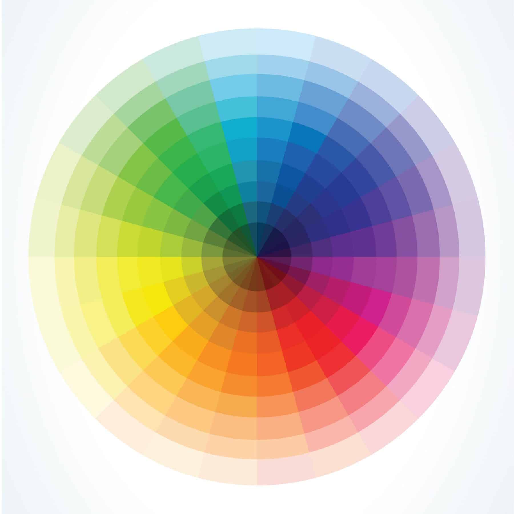
Color subconsciously affects our moods, which in turn affects the actions that we take. In order to get the response that you are looking for from your customers, you need to choose the correct colors, from your website to your emails. Improve your company’s graphic design game by using these tips to pick the perfect color for any occasion!
Energize and Stimulate
If your goal is to invigorate your audience, your best bet is to include red. Red is not only an emotionally intense color – it also affects us physically, increasing respiration rates and raising blood pressure. It is associated with energy, strength power, passion and love. As a highly visible color, red helps enhance text and images, making them stand off the foreground. Red is a great color to use if you want to inspire customers to make impulse purchases.
“Orange is red brought nearer to humanity by yellow,” says Wassily Kandinsky. Like red, orange is a very stimulating and energizing color. Orange can result in different emotions, depending on what shade is used. Darker oranges offer a sense of comfort. Some lighter hues are soothing. Often, this secondary color is representative of the changing of seasons and movement. Here at Midwest Marketing, we use the orange in our logo to promote a sense of positive change (becoming greater than) while giving off a friendly, inviting vibe.
Promote Safety
If your customers turn to you to feel safe, you may want to keep the color green at the top of your color collection. Green suggests stability and endurance and is the most restful color to the human eye. In advertising, green is often used to promote the safeness of medical products. Darker greens are associated with money and are used frequently by financial institutions.
Build Trust
Are you working on gaining more trust with your target audience? Pick blue! Blue has a trustworthy, dependable feel that is often associated with reliability, loyalty, intelligence, faith and truth. Blue is also considered to be beneficial to the mind and body, slowing metabolism and producing a calming effect. Just a warning – blue suppresses the appetite, so you may want to avoid using this color if you are promoting food.
Grab Attention
The human eye processes yellow first, making it the perfect choice for capturing attention. It is the color of happiness, optimism, enlightenment and creativity. It is also associated with youthfulness, so it is great to use when targeting a younger demographic. Yellow is also perfect for catching the eyes of window shoppers!
Soothe and Calm
Purple is the most powerful wavelength of the rainbow, radiating sophistication and mystery. Variations of purple can convey different meanings. For example, light purples are light-hearted, floral and romantic. Dark shades are more intellectual and dignified. Regardless, purple evokes feelings of creativity, imagination and wisdom. Since it is associated with royalty, purple is often seen in the marketing of beauty products.
At Midwest Marketing, our graphic designers can create the right mood to make the most out of your marketing efforts. Contact us today and become greater than!
